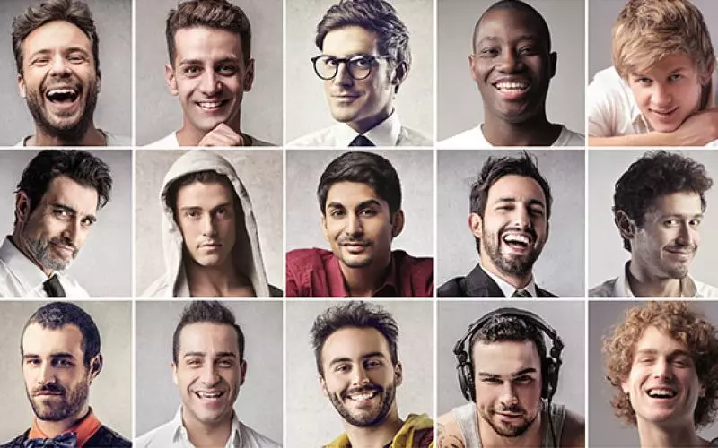
Make your photos pop!
How do you get amazing headshots that pop?
As a web designer, I've heard clients often say "I want my website to POP". Most designers hate that term, because you don't exactly know what to do with it, but if you've been doing this long enough, you get a grasp of what people mean to make it pop - you want it to be clean, but professional. Colorful, but not to loud. I get it.
In case of your headshots, you need to try your best that they are intriguing and memorable. If that's not the case, you might not get called in for an audition. Keep in mind that on every occasion you're submitted for a position, you're competing with dozens, sometimes hundreds of different actors for that part. In fact, the average co-star or guest-star position gets about 3,000 submissions... from time to time that number goes into 5 digits!
Casting directors do not have sufficient time and can not look through all of the submissions, so making sure that your headshot stands out, might get you called in for that next audition. If your headshot is exciting, they may go to your website, and briefly look at your other profiles.
Many people declare to be "headshot" photographers. simply because someone claims to
do headshots, would not imply they are great at it. Keep that in mind hiring a
headshot photographer.
In short: your headshot is often your gateway to an audition so chose your photographer wisely.
So, what kind of photos should you consider? Just because someone has a great camera and does magic in Photoshop, doesn't mean that those photos will grab someone's attention. You want them to appearance as lifelike as possible. So here are some no-nos when selecting the perfect photo:
- it doesn't look like you - this one's obvious, but you'd be surprised how many times people submit photos with all the blemishes photoshoped away and the photo just doesn't look realistic. Yes, you want to get your hair and makeup done to match the specific look, but you still want to look like you.
- the photo is a good representation of who you are - if you don't have a quirky personality at all, yet take photos that appear as if you're a walking, breathing character, you may need to reconsider your choices. And while we're on character, don't wear clothes with logos or words.
- it's too zoomed in, doesn't capture your entire essence, focusing only on your face. You want people to see you, it doesn't necessarily mean zoom out so we can see what shoes you're wearing, but if your ears are cropped away, it's a sign you're waaay too close to the lenses. (besides, the further away you get these, the better chance to find nice photos for your website as well)
- this said, the photo should be a portrait photo. Landscape photos work well with your website, and other online profiles, but the headshots you submit should be in portrait mode as the horizontal photos waste space on the sides
- too many filters applied to the photo - it is not a competition for photography or editing, it should portray you as you are
And here are some things you do want:
- Simple background, the simpler the better. It can be blurry, so that it screams that the focus is on you!
- Make sure your eyes get the focus. A cool tip for verifying it, open the photo on your computer and zoom in. Most photos are great quality that you can zoom in on your eyes. You can spot if the focus is off when your eyelashes and in some cases, your eyebrows look smudged.
I hope this helps.


